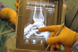
Apple's iPad has generated much excitement for on-the-go viewing of images. However, a team from Fraunhofer MEVIS in Germany has found the popular tablet can also be utilized to provide more efficient interaction with breast MR images on diagnostic displays.
The researchers have developed a prototype system that comprises a touchscreen-based user interface for the iPad, two diagnostic monitors, and a dedicated workflow engine. They believe their approach can enable workflow improvements over traditional breast MRI workstation environments.
"Current breast MRI software normally follows a 'random access' paradigm: choose what series/contrast to look at (e.g., subtraction), choose your overlay, maximize to full screen if you want, select a processing tool (out of very many), select one of the plenty measurement/annotation tools ... and then revert all back to default and start over with the next contrast (e.g., T1 versus T2)," Markus Harz told AuntMinnieEurope.com. "We oppose this paradigm by providing a workflow approach, where all [image] hangings show one of the contrasts in focus, and ease transitions to the other [image] hangings."
A new viewing model
Users connect their iPad to a display station by scanning its QR Code, which will provide its location and capabilities. Once the iPad has read the code, the software's location awareness mechanism identifies the display and configures the user interface based on the available tools for the display and the specific user.
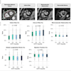
A patient overview screen provides patient history along with clinical events and risk data, according to the researchers.
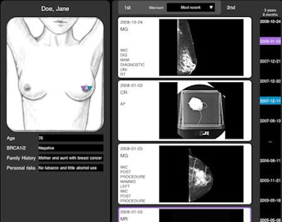 Patient overview screen on the iPad. Tapping and holding one of the thumbnails brings up a large image preview on the main monitors along with the report. All images courtesy of Markus Harz.
All tool bars and menus have been removed from the application, since only a very small subset of available tools are routinely used in the interpreting of breast MR exams. Furthermore, touch-based interaction avoids the need for a pointing device and its inherent limitations.
The software also makes use of preconfigured workflow steps, which are executed on a swipe-by-swipe basis. A touch-area layout changes to accommodate interaction, and users can navigate through an image slice by pointing and sliding on finger. For example, sliding two fingers vertically on the touch display enables stacking through the images of a series.
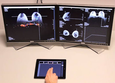 Two-finger sliding allows for stacking (up/down motion) and adjustment of color overlay (left/right motion).
Controlled via context-sensitive gestures, capabilities such as an annotation tool, a tool to measure the sizes of findings, as well as a tool to indicate distance to the chest wall and the nipple can be accessed by touching and holding on the display. One-click automatic mass segmentation also is included, Harz said, adding that the software is currently undergoing clinical evaluation.
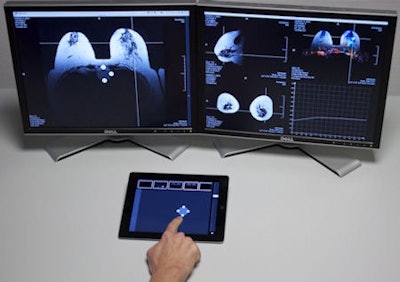 A context menu can be invoked with a one-finger, tap-and-hold motion. Users can then select the tool they want by sliding in its direction on the menu, and then removing the finger once the selected tool is highlighted. The circular context menu is shown on the iPad, as well as the main display screens to allow the users to keep their eyes on the main screens all the time.
In the future, the researchers hope to expand the system to support modalities such as mammography and tomosynthesis.
"I believe that there have been aspects that are very convenient about film-screen reading that have got lost in the transition to digital mammography, and I am thinking about ways to bring that back," Harz said. "Also, we expect that in areas other than diagnostic reading/radiology there might be useful applications, most notably in the emergency room, where patients quickly transition from station to station, or for situations with many different equipment in one place -- e.g., operating room or scanner rooms (CT, CR) where the iPad could support a lot in acquisition preparation."


